CC Search Redesign
cc-search productIn 2018, Creative Commons started a project to build a new, improved front door to the Commons, and in September 2018, a beta version of this new CC Search product was released to the public. This is what it looked like back then:
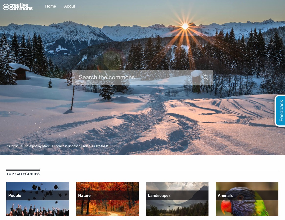
You can see that the home page is quite convoluted, with a lot of things presented to the user right from the start. And one of the main problems that we identified during some of our usability testing was that it didn't look exactly like a search engine page. Maybe it looked like an image gallery website? Moreover, the "Search the commons..." placeholder text on the search box isn't really clear, unless you are someone familiar with Creative Commons and know what The Commons represents.
But the biggest problem was that it didn't look at all like any of the other CC pages. So our intuition was that if we linked this on the CC homepage, people would have gone to a different environment that looked and felt different from where they were previously. Unlike in other platforms where every tool follows similar UI patterns under a single visual identity.
We then decided to do a redesign of the entire CC Search website, addressing the issues described previously, and at the same time, fixing some other usability issues we had already identified. This redesign started around the end of March 2019, and we decided on having it ready in time for the CC Summit at the end of May. That gave us around two months to work on the following items.
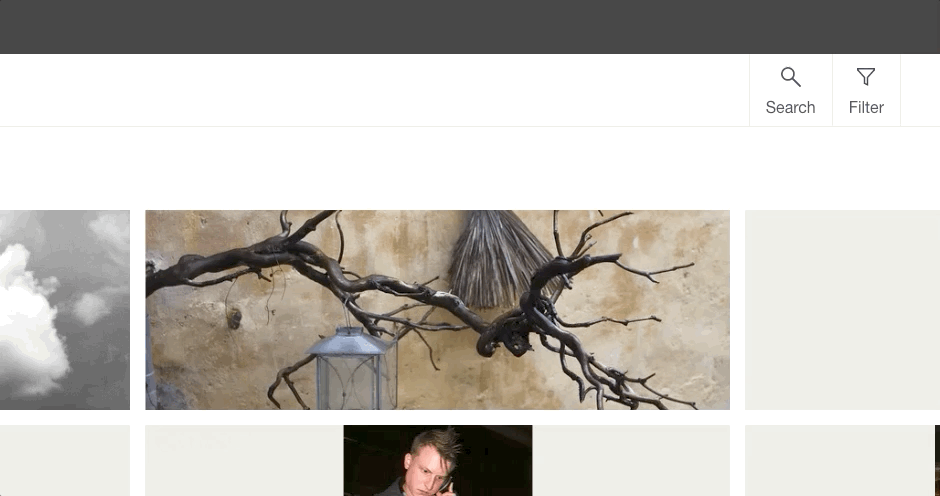
The homepage
We started the redesign of the homepage by removing all that content that was distracting to the user: the background image, top categories, suggested images, therefore having only the essential on the homepage: a search box, a navigation bar, and a footer with some legal information.
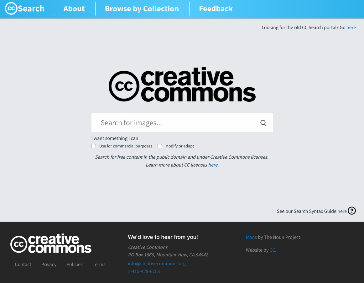
There's a lot less "noise" on the new homepage. It also follows more of the design you can see on the Creative Commons homepage, https://creativecommons.org/. Initially, we planned to follow the same color scheme, but in internal conversations, we decided to have each of CC's main pages have some colors of its own, so they are more easily recognizable by users. So we dropped the orange from CC's homepage in favour of this light blue you see now.
We also replaced the "Search the Commons..." placeholder on the search text box for "Search for images...". As we currently provide only image search, users can more easily and intuitively know what they will be searching for using our tool, instead of hoping to find textbooks or video works in the results because "Search the commons..." could have meant search the full Commons corpus.
Search results
Along with the redesign of the overall look and feel of the website and the homepage, we made some improvements to the search results page as well.
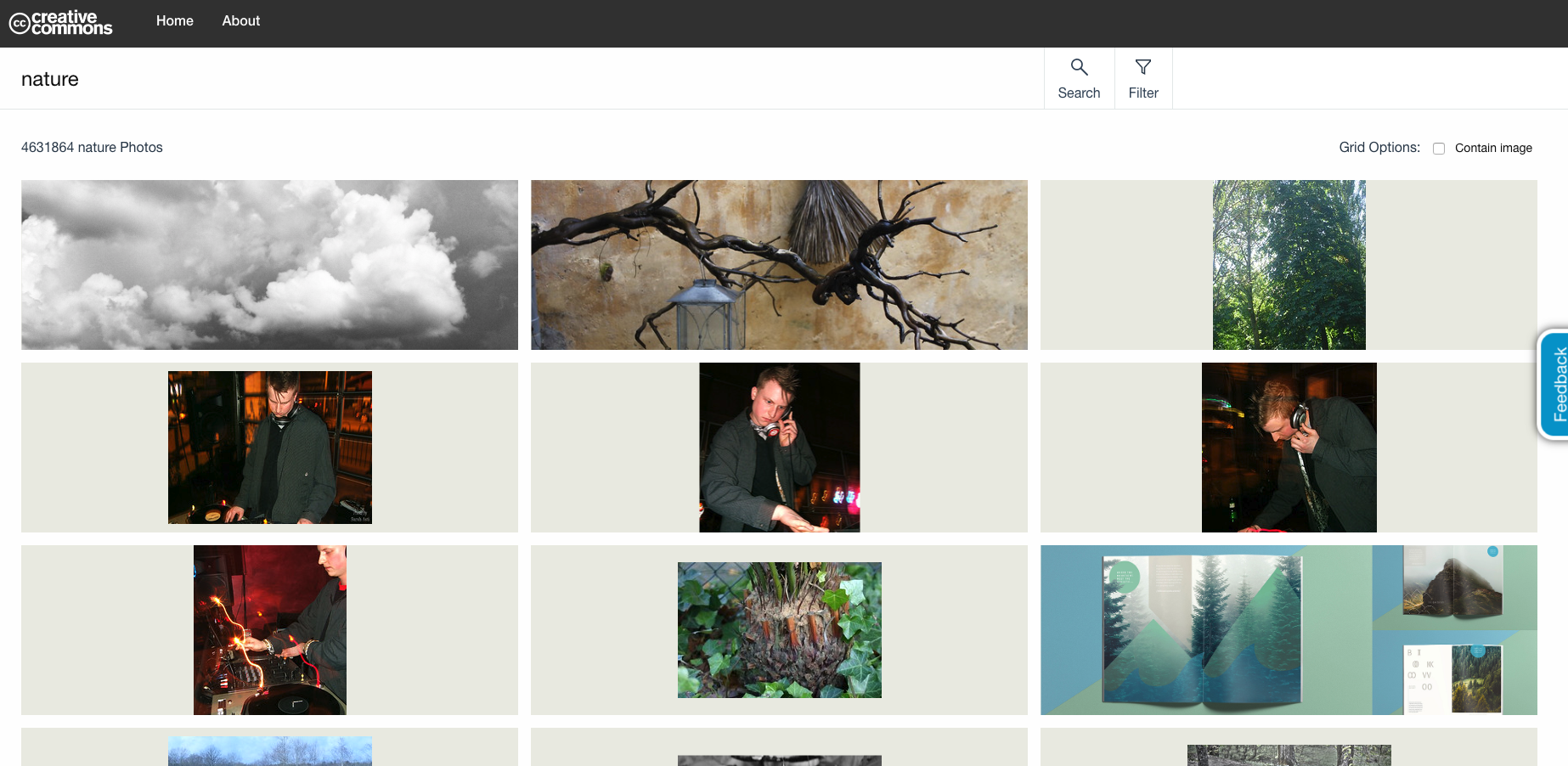
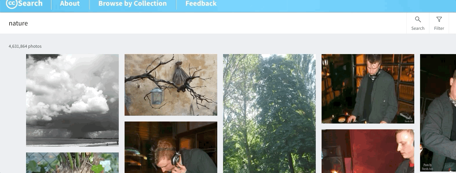
As you can see, the old results are displayed in rows of three columns of fixed width and as a result, many of those image-container boxes have a lot of empty space, except for images that fit into a landscape orientation. If the image is in portrait orientation, or a square resolution, which tends to be a large portion of the total collection, we end up with a lot of unused space.
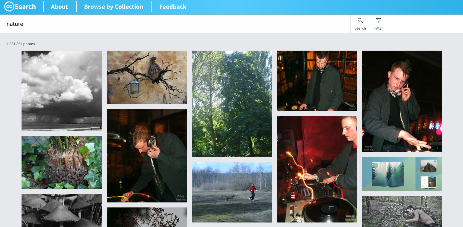
The new search results page address this by removing the container box and displaying them in a grid that maximizes the available space for every image, considering its orientation and resolution. Now the user can see more images at a single glance, without having to scroll down as much to see more of the results. We are also able to render the full image in this new design, as opposed to the old one, where we would sometimes scale the images to fit into the rectangle-shaped container box, sometimes cropping out a part of some images.
Filters
This is a smaller update, changing the location and layout of the search filters.
With this new layout, when the select dropdowns are open, they don't hide the other filter components. And they now take less space since they are displayed one next to the other, as opposed to one below the other in the old design.
There's been some feedback from the community requesting additional filters, such as resolution, image type (such as illustrations, vector graphics, etc..), and a few others. So this is a piece of UI that might change in the future.
Photo details
On this page, what we did was more of a rearrangement and change of layout instead of a full redesign. The information there is still the same, but we added a few things, which, if we still had the same layout, would result in a lot of information cramped and cluttered in a tight space.
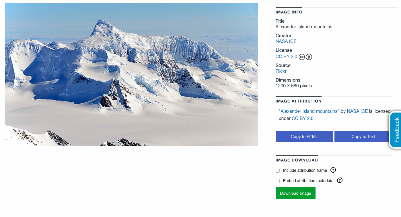
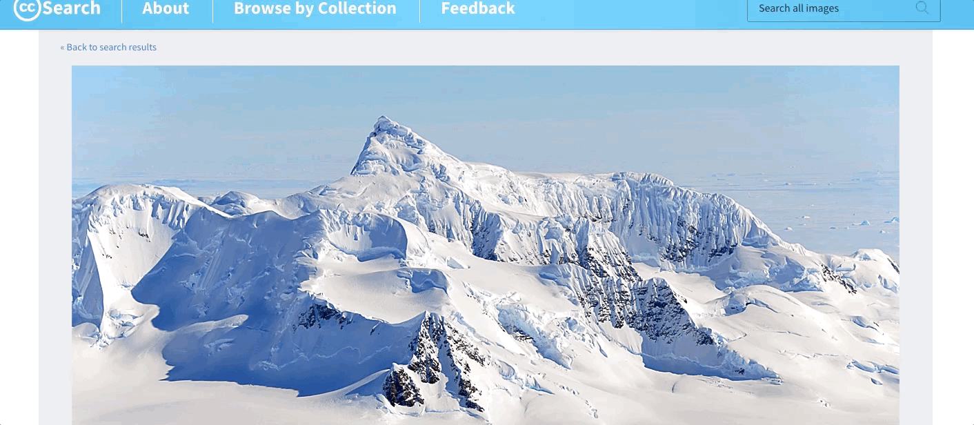
What we ended up with is a page that makes the photo itself stand out among everything else, and we split distinct pieces of information in separate tabs below the image. This gave us the possibility of adding more information of a particular domain without mixing it with a bunch of unrelated data that distracts the user and results in information confusion.
Next steps
Now we're in a phase of making small improvements to this UI standard. Like we said before, there's some recurrent feedback from the community asking for additional image filters, so we're planning to add that soon.
As part of our Google Summer of Code initiative, we have a project called CC Vocabulary that aims to build a set of reusable UI styles and components that will be used across all CC websites. Soon this will also be integrated into the CC Search website.
If you have any feedback, please feel free to send your thoughts and opinions here.
If you feel like contributing to the CC Search frontend code, please refer to our Contribution guide and to the CC Search frontend codebase.