
In this blog, I will be talking about how I managed to use Vocabulary ( Creative Commons's Design Library ) efficiently in our Open Source website.
What is Vocabulary?
Vocabulary is a cohesive design system to unite the web-facing Creative Commons. In essence Vocabulary is a component library that uses and extends Bulma CSS library. Vocabulary makes it easier to develop Creative Commons apps while ensuring a consistently familiar experience. This project is still under development.
Why Vocabulary?
Vocabulary is used to describe the overall visual design of our digital products. At first glance, it appears to be: an amalgamation of component designs with a consistent visual aesthetic and brand, typically accompanied by usage guidelines in the form of online documentation. But there is a lot more to it. When it comes to a large software community with a huge range of products, certain problems come along. One of those problems is maintaining the level of harmony across all the products of the network. So, there comes a need for a unified visual language that heightens the level of harmony in a digital ecosystem. And in our case, Vocabulary solves this problem. This design system is well built and helps us bring the following aspects to the table -
- Recognizability
- Consistency
- Authenticity
- Efficiency
And many more.
How did I use it? — Examples
As I stated before, I have added Vocabulary by updating all the Templates in the CCOS Lektor project.
As far as components are concerned, I just had to paste the code snippets given on the Vocabulary’s website with the requires changes -
Integration of Breadcrumb -
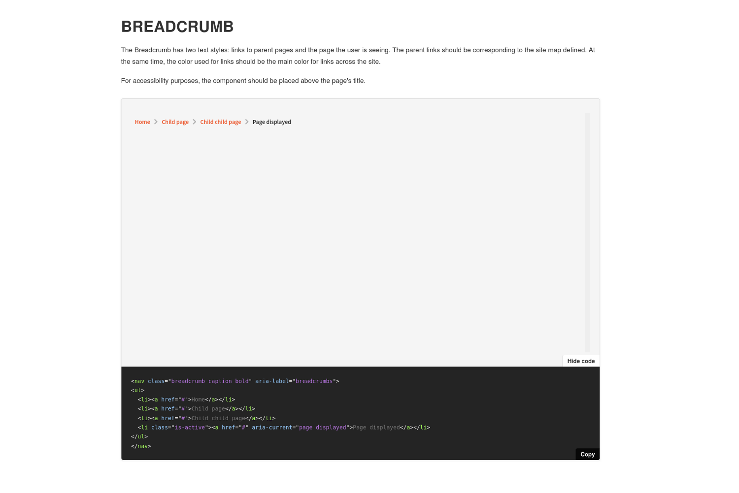
The code for integration —
<!-- Breadcrumb -->
  {% if this._path !=  '/'%}
    <div class="breadcrumb-container">
      <nav class="container breadcrumb caption bold" aria-label="breadcrumbs">
        <ul>
          {% set crumbs = [] %}
          {% set current = {'crumb': this} %}
          <!-- Extracting the slugs of URL -->
          {% for i in this._path.split("/") %}
            {% if current.crumb is not none %}
              {% if crumbs.insert(0, current.crumb._slug) %}{% endif %}
              {% if current.update({"crumb": current.crumb.parent}) %}{% endif %}
            {% endif %}
          {% endfor %}
          {% for crumb in crumbs %}
            <!-- Active link -->
            {% if this._slug == crumb %}
              <li class="is-active"><a aria-current="page displayed">{{ crumb | title | replace('-', ' ') }}</a></li>
            {% else %}
              <!-- Forming the URL using extracted slugs -->
              {% set i = loop.index %}
              {% set ns = namespace (link = '') %}
              {% for j in range(i) %}
                {% set ns.link = ns.link + crumbs[j] + '/' %}
              {% endfor %}
              <li><a class="link" href="{{ ns.link|url }}">
              {% if crumb != '' %}
                {{ crumb | title | replace('-', ' ') }}
              {% else %}
                Home
              {% endif %}
              </a></li>
            {% endif %}
          {% endfor %}
        </ul>
      </nav>
    </div>
  {% endif %}
Other than the components, there are other visual elements like typography, colors, spacing, and others that are extensively used in CCOS.
This is code for the Hero section of the home page.
The block template -
<section class="hero">
  <div class="container">
    <div class="hero-title column is-12 is-paddingless">
      <h1>
        {{ this.title }}
      </h1>
    </div>
    <div class="columns">
      <div class="column is-5">
        <p class="hero-description">
          {{ this.description }}
        </p>
        {{ this.links }}
      </div>
    </div>
  </div>
  <div class="level-right hero-image">
    <img class="image" src="./github.svg" />
  </div>
</section>
The block styling -
// Hero section - Home page
.hero {
  @extend .margin-top-large;

  .hero-title {
    @extend .padding-horizontal-big;
  }

  .hero-description {
    @extend .body-bigger;
    @extend .padding-top-big;
    @extend .padding-horizontal-big;
  }

  .hero-links {
    @extend .margin-vertical-normal;
    @extend .padding-horizontal-big;

    .button {
      @extend .margin-top-normal;
      text-decoration: none;

      .icon {
        @extend .margin-right-small;
        @extend .padding-vertical-smaller;
      }
    }
  }

  .hero-image {
    @include from($fullhd) {
      margin-top: -20rem;
      .image {
        width: 50%;
      }
    }
    @include until($fullhd) {
      .image {
        width: 100%;
      }
    }
  }
}
Improvements in the Lektor project -
I tried to write the perfect code that is cleaner and readable. I would try to demonstrate my effort using the home page code where I used Lektor Flowblocks. The new homepage design have four sections where each section communicated something and I realized they were all independent and building the whole page through one single template would become a bit messy and hard to handle. So I did some research and found a way where I could build sub-templates and use them all to develop a single page and Lektor’s flowblocks allowed me to do so. Here is one of the flowblock and if you want to check out the whole working you can go to — CCOS Repository.
Recent Blog Post block -
The block Template -
{% from "macros/author_name.html" import render_author_name %}

<section class="recent-posts">
  <div class="container">
    <div class="level">
      <h2 class="is-paddingless level-left">
        {{ this.title }}
      </h2>
      <span class="level-right">
        <a class="posts-link" href="/blog">See all posts <i class="icon angle-right"></i></a>
      </span>
    </div>
    <div class="columns">
      {% for post in site.query('/blog/entries') %}
        {% if loop.index <= 3 %}
          {% set author = post.parent.parent.children.get('authors').children.get(post.author) %}
          <div class="column is-one-third is-paddingless padding-horizontal-big padding-top-bigger">
            <article class="card entry-post horizontal no-border blog-entry">
              <header>
                <figure class="image blog-image">
                {% if author.about %}
                  {% if author.md5_hashed_email %}
                    <img class="profile" src="https://secure.gravatar.com/avatar/{{ author.md5_hashed_email }}?size=200"
                    alt="gravatar" />
                  {% endif %}
                {% endif %}
                </figure>
              </header>
              <div class="blog-content">
                <h4 class="b-header"><a class="blog-title" href="{{ post|url }}">{{ post.title }}</a></h4>
                <span class="blog-author">by <a class="author-name" href="{{ author|url }}">{{ render_author_name(author) }}</a>
                on {{ post.pub_date|dateformat("YYYY-MM-dd") }}</span>
                <div class="excerpt">
                  {{ post.body | excerpt | string | striptags() | truncate(100) }}
                </div>
              </div>
            </article>
          </div>
        {% endif %}
      {% endfor %}
    </div>
  </div>
</section>
The block Model -
[block]
name = Recent Posts

[fields.title]
label = Title
type = string
The block styling -
// Recent-posts section - Home page
.recent-posts {
  background-color: rgba(4, 166, 53, 0.1);

  .container {
    @extend .padding-vertical-xl;
    @extend .padding-horizontal-big;

    .columns {
      @extend .padding-top-bigger;
      @extend .padding-bottom-xl;
    }
  }

  .blog-title {
    @extend .has-color-dark-slate-gray;
  }

  .posts-link {
    @extend .has-color-forest-green;
    @extend .body-normal;

    font-weight: bold;
    line-height: 1.5;
    text-decoration: none;

    .icon {
      @extend .has-color-forest-green;
      @extend .padding-left-small;
    }
  }
}

I would also like to point out the amazing Query functionality provided by Lektor where you can access the child pages of the root. Here I am accessing blog posts from our Blog page and limiting the count of posts to three.
Difference in Experience
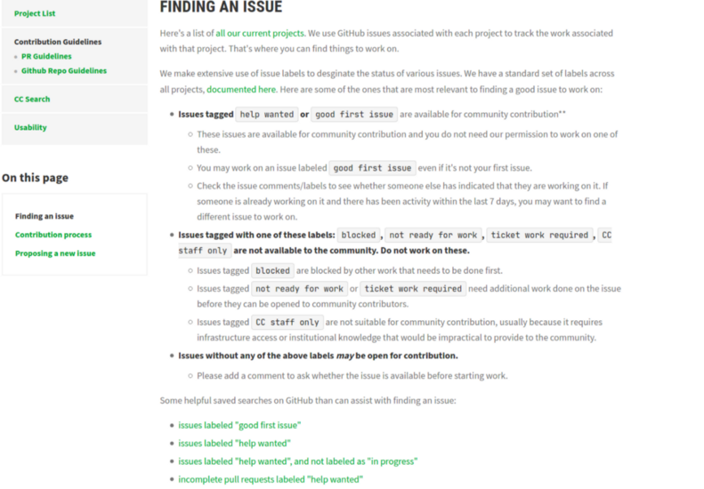
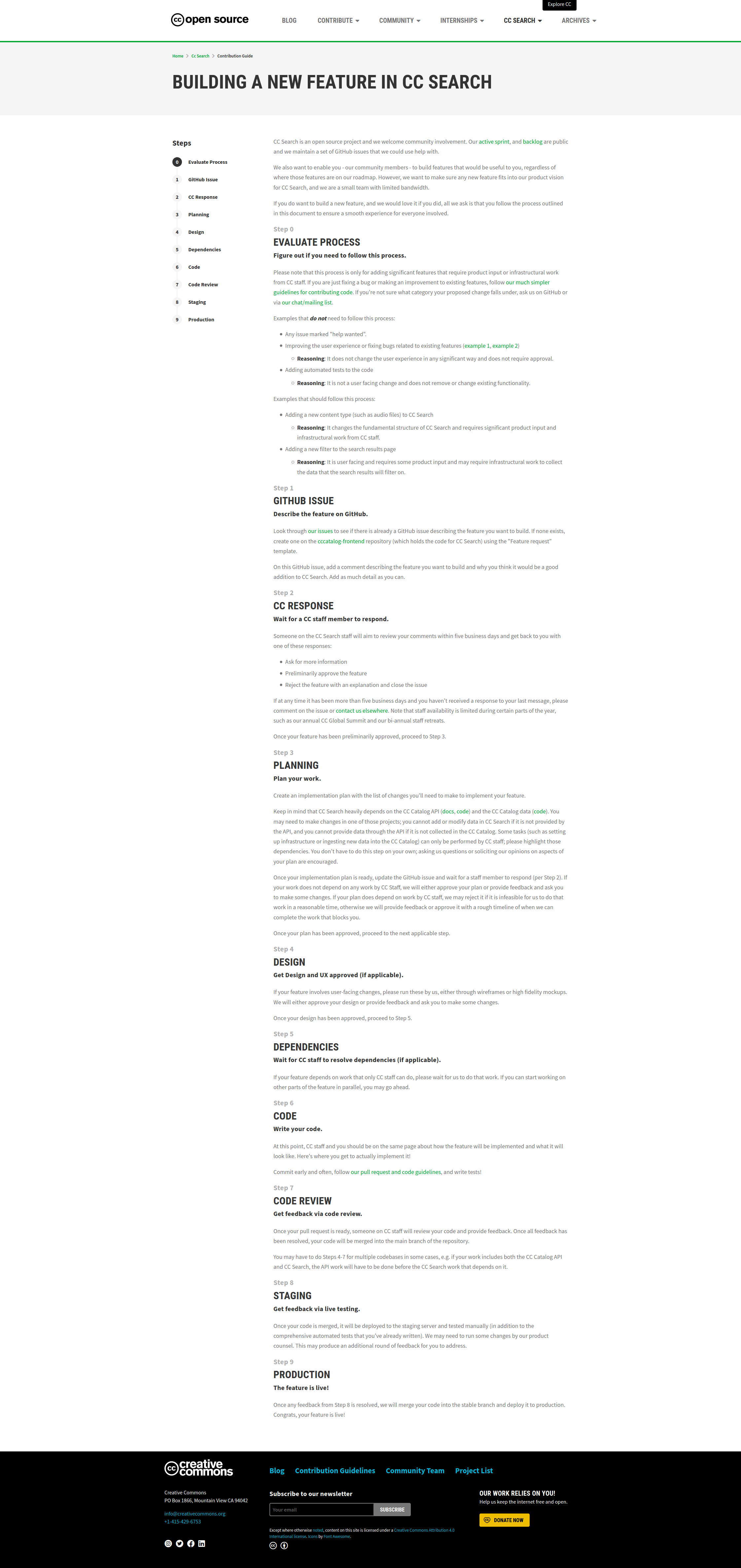
The level of user experience has been significantly elevated due to the use of Vocabulary. I would like to point one of the major experience change here. The major part of the website is guidelines — we have guidelines for contributing, guidelines for how to join a community, guidelines for how to write a blog and many more. The new website has cleaner and readable guideline with a proper hierarchy and every piece of information is made accessible using secondary navigation.
Below are the images of some guidelines pages from new website.
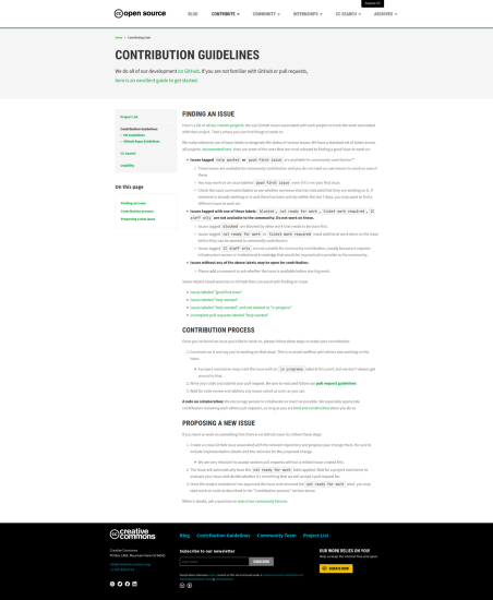
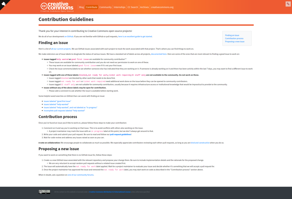
Below are the images of some guidelines pages from old website. You can see the difference of experience in both cases.
How you can use Vocabulary and also contribute to it?
Vocabulary is very easy to use. It is intuitive, consistent and highly reusable. Vocabulary uses Storybook to present each visual element that makes it very convenient for a user to integrate Vocabulary in their project. The code snippets attached with every element can be copied as it is and can be used. The code snippets above indicate how the library can be used and how easily you can achieve desired web pages. For more details, you can visit usage guidelines.
Vocabulary is still under development, feedback and bug reports are welcome, fixes and patches even more so. Here is the link to contribution guidelines.