ℹ️ 2023-08-31: This project was archived along with the shuttering of CC
Search (now Openverse). Please also see the
Quantifying the Commons
project.
This is a continuation of my last blog post about the data processing part 2 of the CC-data catalog visualization project. I recommend you to read that last post for a better understanding of what I'll explain here.
Hello! In this post I am going to talk you about the extraction of unique nodes, and links, and the visualization of the force-directed graph with the processed data.
Nodes and links generation
The nodes and links will be visualized using force-graph. I spoke about this library in my blog post: Visualize CC Catalog data. My first step is to use the data to generate the json file that it needs. Force-graph needs to be passed a single json file with two lists: one containing information about the nodes, and the other containing the links. They are both arrays of dictionaries. I have huge input files (and over 100 million unique domains in total). So in Pandas I need to build a DataFrame of a tsv input file using chunks. The challenge I am facing now is to generate a list of unique nodes. Here is why this is a challenge:
- In order to build the nodes list, I need to think aboutwhat are the source and target nodes.
- Take into account a source node can also be a target node.
- I can delete duplicate entries per column, but as I process the data in chunks, my scope is limited to the chunk size.
- A domain can be repeated not only within a chunk, but in different chunks too.
- Source and target must have licensed content
So as you can see, dealing with duplications is not that trivial when you have a lot of data. Next what I tried was to analyze smaller files, in order to be able to keep the data in memory in a single DataFrame. So for each TSV file I had before, now I have several small TSV files. This may extend the data analysis, but it can smooth the coding complexity.
I first started by formatting the data into source and target columns to generate the unique nodes for the graph. I iterate through each row of the current DataFrame I have (the one with provider_domain, cc_licences,links column, etc), and by reading the links column, I load the json of each row. For each key in the json, I create a new row with provider_domain as source, they key as target, and the value of the key as a value feature. I append that new row to a new DataFrame. I build a new row each time I read a line, so I have a DataFrame with all the links of a single provider_domain. When I finish iterating over the rows, I convert the DataFrames to list and save the output. That is how I get a new DataFrame containing all the existing links of the graph, with source, target and value columns. Yeah!
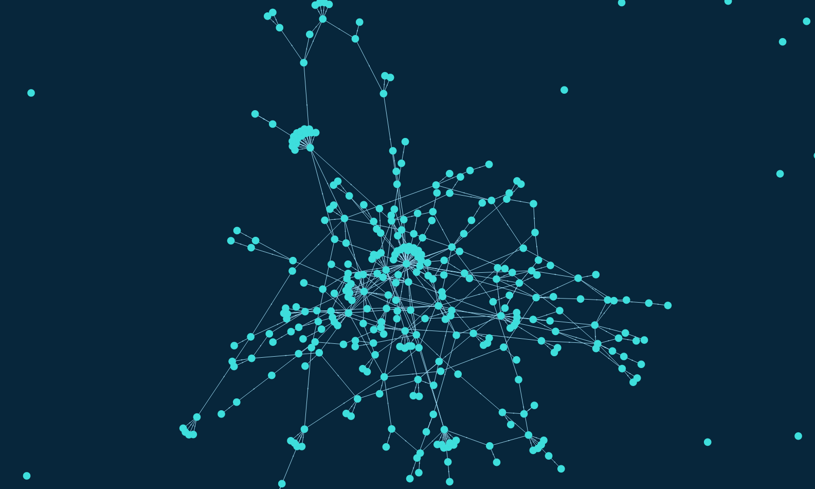
The visualization I get is the following:
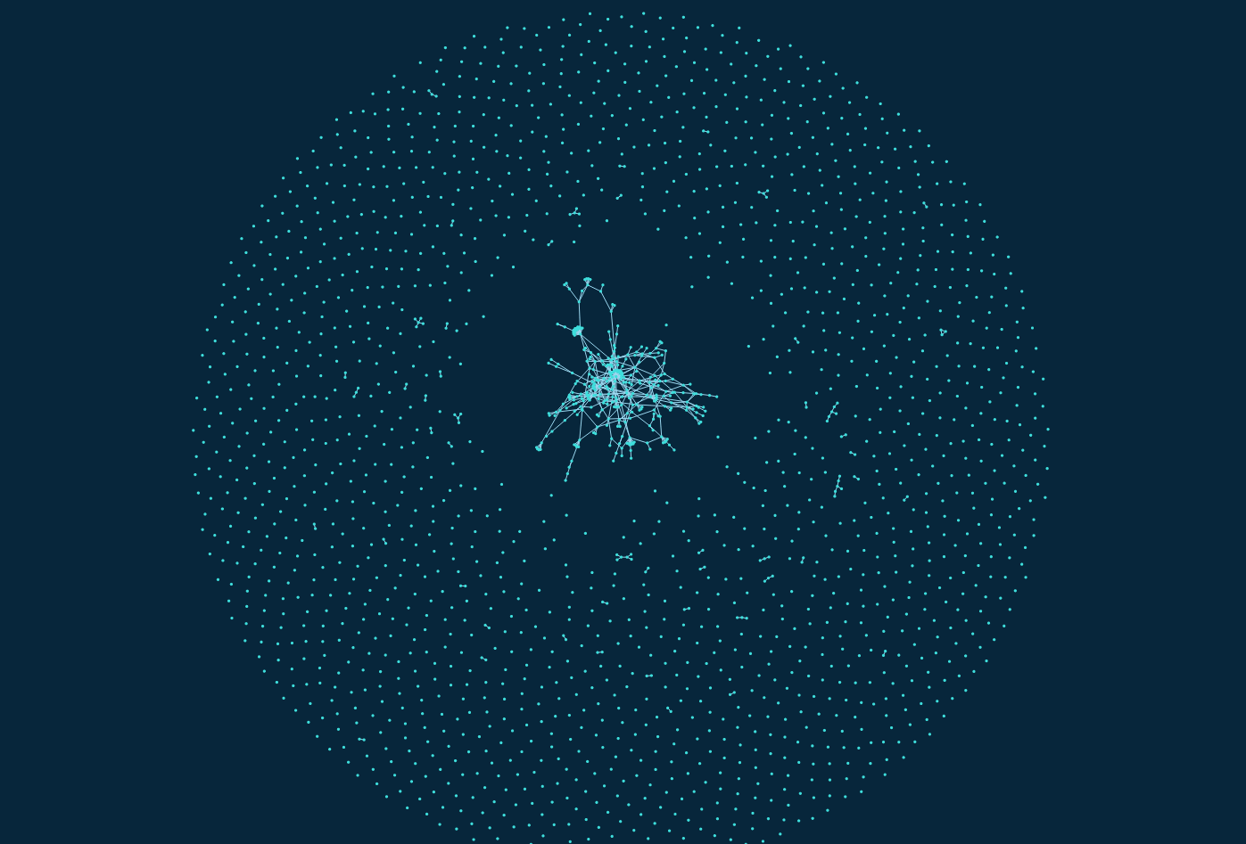 Force-directed graph with the real data.
 Force-directed graph with the real data.
Coming soon
As you could visualize before, there are a lot of lonely nodes (nodes with no neighbors). My thoughts are to filter out the provider_domains that do not have a minimum quantity of licensed content. I will try with different values, starting form 100 to 1000, and see how the graph changes. I believe a lot of those nodes do not have a relevant amount of licensed content, so with this filter rule they will be removed.
The other tasks left to do are:
- Visualization of the pie chart
- Development or modification of pruning/filtering rules.
You can follow the project development in the Github repo.
CC Data Catalog Visualization is my GSoC 2019 project under the guidance of Sophine
Clachar, who has been greatly helpful and considerate since the GSoC application period. Also, my backup mentor, Breno Ferreira, and engineering director Kriti
Godey, have been very supportive.
Have a nice week!
Maria