ℹ️ 2023-08-31: This project was archived along with the shuttering of CC
Search (now Openverse). Please also see the
Quantifying the Commons
project.
This is a continuation of my last blog post about the data processing part 3 of the CC-data catalog visualization project. I recommend you to read that last post for a better understanding of what I'll explain here.
Hello! In this last post, I am going to talk you about the final visualization. First, I would like to talk about the data and share my recommendations.
Creating a data-driven graph
+250 million licensed content is a very big number. That is the amount of data I had to visualize for this GSoC project. The graph is very sensitive to the amount of data. Let's talk about sensitivity as the property that a visualization has to look well-structured or tightly clustered like a hairball. The graph is less sensitive to the data if there are a few hundred or thousand nodes but as the amount of data increases it starts to look more and more like a hairball. Take a look at the following examples:
 The Linked Commons gaph with 20k nodes and links.
 The Linked Commons gaph with 100k nodes and links.
Moreover, any visualization library starts to render the elements slower, and at one point, it freezes. For the 100k nodes graph, the visualization took ages to appear and had the same clustered appearance. This was my major concern. That's why I decided to choose the top 500 domains from the processed data, as well as all the other domains those 500 nodes are connected to. This is also more user-friendly, because having the entire dataset will make the navigation through the graph very dizzy. Even with this smaller dataset, we could get valuable insights from the graph. We were able to find communities like the following:
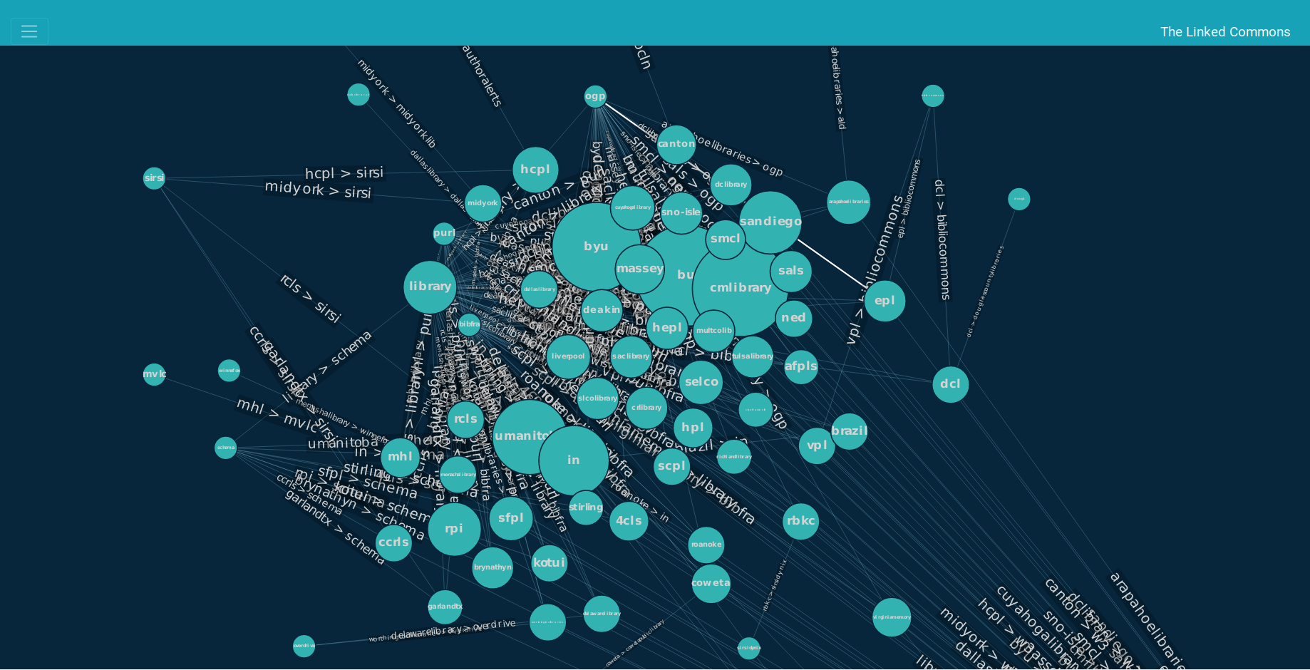 Educational community, including libraries and universities.
Insights like this are valuable for Creative Commons, because they can help with outreach efforts, targeted communications and for the CC Search team to choose which domains to include in the CC Search tool.
The final graph is interactive. Users can pan, zoom in and out, hover over a node to see its neighbors and neighbors of neighbors, and click on a node to display a pie chart.
Pie chart visualization
The pie charts are built using the Highcarts library. The purpose of this chart is to show to the public how each domain uses CC licenses. I spoke about this in my blog post: Visualize CC Catalog data. Here is an image to illustrate the above:
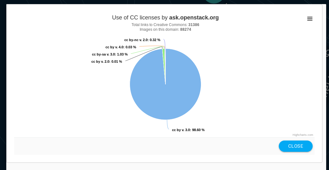 Pie chart of ask.openstack.org
There are some nodes that we do not have information about their CC licenses (and they probably do not have licensed content). For these nodes, a message saying "The CC License information of domain_name is not available" is displayed instead of the pie chart. We did not wanted to disable the pie chart for them, because we wanted to be consistent with the nodes behavior. Making some nodes not clickable would confuse everyone, and it would also make more complicate the implementation of the visualization.
Tweaking the graph
Force-graph has a nice API that offers a lot of possibilites for customizing the visualization. The building of the graph is data-driven, and we can use the data in order to alter the appearance of nodes and edges.
I implemented the following:
- The node size is proportional to the number of CC licensed content in each domain.
- When the user hovers over a node, a label with the domain name is displayed. This might sound redundant when you can see the node perfectly. But the graph is very big, and you will like to see it in a low zoom level in order to have a picture of the shape of the entire graph. This is when this functionality is useful, because you don't have to zoom in in order to see the name of a node.
- The force of a link between two nodes (node A and node B) is given by the number of links node A has that references node B.
- When you hover over a node, you can also see the links to its neighbors highlighted, as well as the links to the neighbors of the neighbors. This feature make it pretty easy for you to find communities, and see how strongly connected a node is in the graph.
Here is the final visualization, using a sample data from one month of the Common Crawl data:
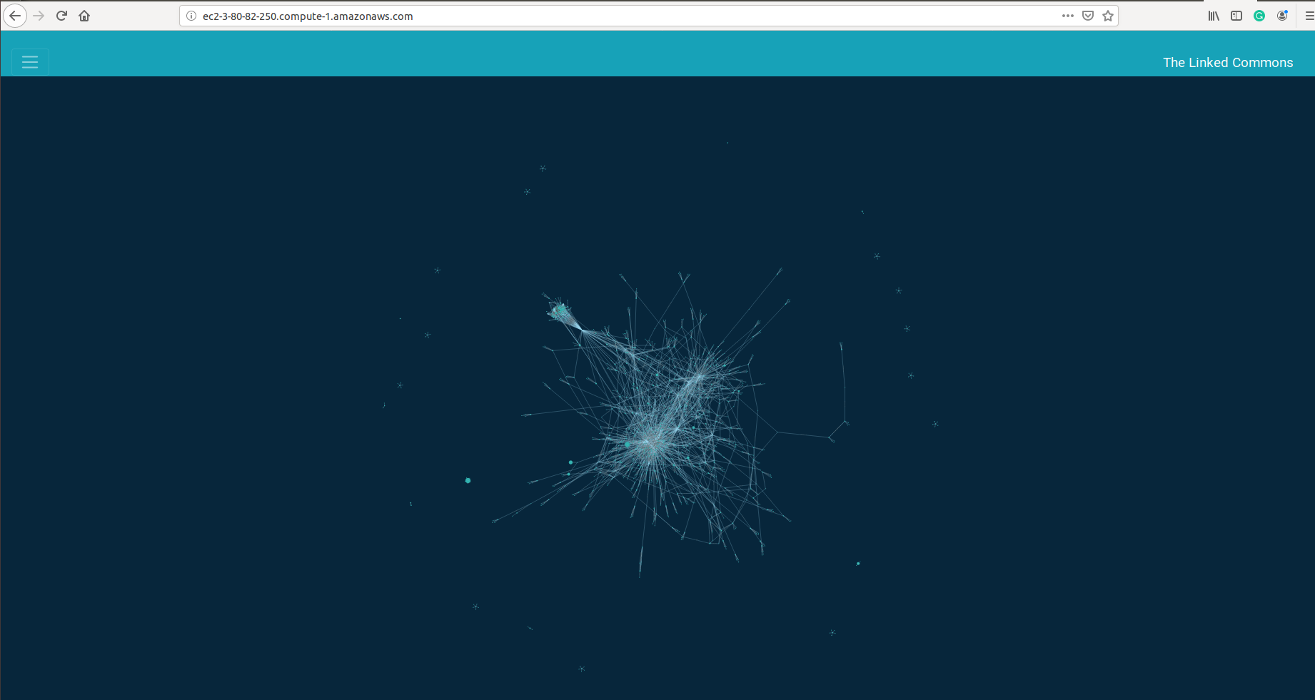 Force-directed graph, "The Linked Commons".
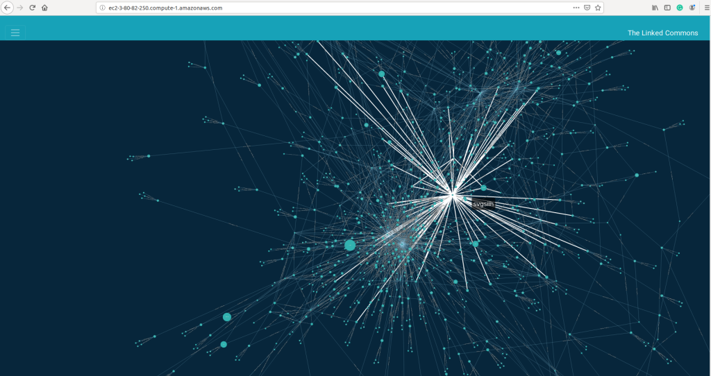 Force-directed graph, "The Linked Commons". Neighbors of domain svgsilh hihglighted.
You can check the whole project source code in the Github repo.
This was my first experience with big data visualization, and I really enjoyed it!
There are features that could be implemented in the future in order to reduce the amount of data rendered in the graph:
- A user might just want to check if a specific domain has licensed content, and how does it use it. An enhancement could be then to add a search bar and offer to the user the possibility to search for a node, given a domain name and/or URL.
- Given the suffix of the URLs of the provider_domains, we could try to find the country of origin, and so filter domains by country.
Check out the live demo!
[2D version] (http://ec2-3-80-82-250.compute-1.amazonaws.com/)
[3D version] (http://ec2-3-80-82-250.compute-1.amazonaws.com/visualization_3d.html)
*Yes, with my mentor Sophine, we thought it could be a great idea to try with a 3D version of the graph :) . You can interact with the graph in the same way as with the 2d version.
CC Data Catalog Visualization is my GSoC 2019 project under the guidance of Sophine
Clachar, who has been greatly helpful and considerate since the GSoC application period. Also, my backup mentor, Breno Ferreira, and engineering director Kriti
Godey, have been very supportive.
I had a great time working with Creative Commons. I hope you like the final product as much as I do. Thank you for following the development of this project.
Have a nice week!
Maria